Solve legacy system issues and improve the UI/UX of your monolith
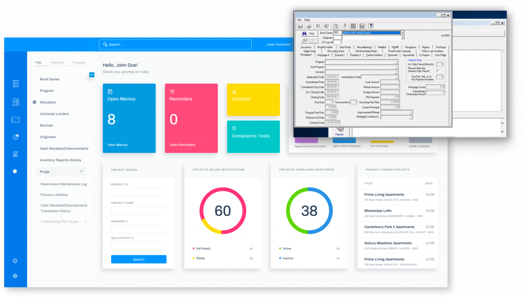
Let’s say you have a legacy application. It has been in development for more than 3 years or longer, and perhaps it was started in the nineties, so you have many customers using the product. It’s an expensive mission-critical product, and its customers are big organizations, enterprises, or even government institutions. When you began developing years ago, your team did not have a dedicated UI/UX designer, and every developer did all the different tasks needed, from back-end to front-end. But now that time has passed, and the application has evolved, you regularly get feedback from your customers that they are no longer satisfied with the UI/UX of the solution.
Changing your UI/UX
You realize that you need to modernize the experience for your customers. However, before you start the modernization, you and your team have to decide on the following questions.
Is it better to make changes to the current UI and improve it, or should we design a new interface from scratch? Most likely, the design is outdated, and making significant changes is almost impossible, especially when it comes to the UX.
If I design a new interface, should I use pure CSS, frameworks like Bootstrap, or use an admin template from Theme Forest?
What will be the roadmap for this change? E.g., understanding the current system, sketching new designs, implementing a new theme, applying it to the system. What happens if the front-end code is mixed with the back-end? Such a significant change might be challenging and may harm customers because they have already developed a specific mental model of the application, based on what they had seen and used over time. How can we reprogram their mental model?
Where do you start your new design journey?
If you think that every company needs to design a new look from scratch or that they have time to build new designs from the ground up, then you are wrong. The design journey is a different journey; you have to begin where you and your customers currently are.
You can develop new things that work for both old and new designs. This approach will give you time to make decisions based on each part of your product, and if needed, it can be reversed easily.
A journey with two designs
How do you accomplish this? By creating two designs! The first design is for the current product: you apply it to each new product development. It includes new components for a new look, while the understanding of the new or improved features or functions grows deeper. The second design is for the future: you apply it after updated products (and your understanding of them) are sufficiently mature that the new design can significantly improve user experience and product complexity.
Get your user feedback quickly
It is essential to deliver new and improved features to the market quickly, and that’s always a priority. But it’s crucial to always get feedback from the users as soon as possible to make sure you avoid over-designing.
One page at a time, you can completely redesign your page structure and apply the first round of design. When you make the changes, they will work with the old UI, and the incremented changes will give a new look to the changed sections. Applying the new design on a step-by-step basis also provides a safer way for you to change your pages in the short term.
So, how will the roadmap look?
Define the new feature’s specs, and then prepare a quick mockup.
Validate your design with the relevant product teams and other stakeholders. Validation is the cornerstone of the process, making sure that all the appropriate decision-makers are involved in the discussion.
When all the decision-makers are on the same page, start implementing the design. There might be some final adjustments that have to be made, but that’s ok. You can even do them while the development team is implementing the design.
Once everything has been tested sufficiently and is usable, deliver the new feature, and immediately seek feedback from the user. You should learn as much from your users as you would from any expert. User feedback is vital for accurately analyzing and understanding their needs, even though you are not obliged to do everything that customers require (or say they require).
If you have the time and resources, you can even add new features to the design roadmap. You can create design boards that analyze and present meaningful data about user behavior. This analysis can provide valuable insight into how to design and direct user experience.
Please don’t confuse agility and quality! If you want to develop and deliver high-quality products, you need to recognize two things:
Quality is a function of available resources, an adequate budget, and a well-defined scope.
Agility is about living with some uncertainty, while you keep an eye on your destination — rather than about sacrificing the basics of your new feature.
By Liviu Oros, Senior UI/UX designer
STAY TUNED
Subscribe to our newsletter today and get regular updates on customer cases, blog posts, best practices and events.


